Monday, 30 April 2012

Going Up

Blurred
For this image I decided to experiment with pathways and blurring the line between reality and fantasy.

The first image was an attempt to create a dizzying effect using the camera alone with the intent to later add the clouds/light bulbs if I managed to pull it off. I liked the image but there is too much unintentional blur in the image for me to use it as I'd wished. It does however create an effect of an irrepressoble event, as if you have no choice but o move towards the blue in the distance. The orientation of the image also works to great effect as it just makes it look as if it would be even more difficult to gain a foothold if you were a part of the image. It doesn't quite capture what I initially intended but the photo does convey a sense of velocity that I hadn't thought about and it makes me want to include motion-photography in this project at a later stage hopefully when I have sorted out exactly what I want my final-piece to be.

Stairway to heaven: First Attempt

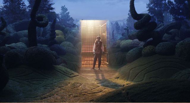
The rest of the picture I took strictly with the intent to create the original image I had planned. One of the problems I learnt of when taking the photos was that I couldn't achieve a steep enough angle that would allow me to place light bulbs on the stairs in post-production so I decided to slightly alter the image a bit and add some images of hot-air balloons I had taken previously, this would add another but significantly different aspect to the image slightly altering my own intepretation.

I eventually captured an image I could use and when I opened it on Photoshop I changed the colouring to a very dark blue to create something that was more intimidating than the futuristic chrome it originally was. After that I changed the photo of the clouds I had so it was coloured gold (the typical intepretaion of heaven) and I alligned it with the escalator's exit so the image really started to emerge as a bonafide stairway to heaven. I desaturated the balloon slightly so they didn't stand out so much against the cloud background. I also added a gold coloured rim around te exit to make it seem slightly more natural. The main problem I encountered was creating accurate lighting. I wanted the lighitng from the gold clouds to filter through into the escalator area but I couldn't replicate the effect without it coming out looking shoddy. I intend to rectify this at a later date but I didn't have enough time for it.

When I showed the image to my mother and my sister, they both came out with different interpretations of the it. My mother saw the balloons as some sort of symbol for freedom whilst my sister saw the that the image wasn't actually set completely straight and saw it as an indication that the route forward wasn't as straight forward as it may seem. The difference in their thoughts pleased me as it was a common trait of Sarolta Ban's images that they were always open to different interpretations and I'm happy that I achieved something similar.

Sunday, 29 April 2012

Doorway Research

With the results of my last shoot I decided upon a focus for my project. Mostly inspired by the wardrobe in The Chronicles of Narnia, I decided to work with the concept of doorways to different places, both complimenting the theme of 'Combinations' and the work of Sarolta Ban. Composition will play a great part in this project and I have to take great care that each 'doorway' is in contrast to the destination. I'm still unsure whether I'll be using a consistent image of a door or whether it'll be different for each image. However I already have some destinations for photoshoots in mind.

I like the concept of the doorway in the image here because you don't actually see the door. It's like a portal to another dimension that's just sprung up out of nowhere.

I like the idea of there being a versatility in regards to how I actually of being able to play with the actual doorways used whether it be an actual door, a frame-less door way or a doorway.

Saturday, 28 April 2012

Doorway contact sheet

Most of the pictures taken had the intention of some photo compositing afterwards. I don't think the lighting on the door will work in the darker scenery of Brick Lane though. I'll make a meal of it though.

Doorway (flop)

This was my  first and only attempt at the 'Doorway' project. I didn't achieve the desired effect and I think this was partly because  I didn't have enough time to work on the image. The orientation of the door isn't correct and neither is the lighting. This is because the picture of the door was actually taken indoors instead of outdoors in a place of similar lighting to the surroundings. I also think the image won't be as effective if I don't heft an actual door around with for the sake of each image. Having an artificial door just isn't as effective because it is doesn't convey the concept of the surreal with a door in pristine condition sitting in a rural area. It just looks awkward to me. I'm also not sure if the scale of the door is realistic.

Friday, 27 April 2012

Paranormal Research

 Because I was unable to continue with my previous concept I decided to move on to a different idea inspired by pictures of the paranormal I came across on the internet and partly by films such as 'Ghostbusters'. After some research involving trawling movie posters and the internet for references to ghosts in media, I came across two images which summed up the effect I wanted to have. A common, run-of-the-mill setting with one solitary creepy element that wouldn't be immediately noticeable. The figure of a ghost. The use of lighting would  be essential in this project as well as post-processing additions such as grain and contrast to create something that looks authentically paranormal.

Home-made Ghost

My first attempt came from a spur of the moment shoot, I took shots in around my house (mainly the bathroom) in the middle of the night. I initially planned to create the ghostly effect by taking a picture of the background and then Photoshop'ing a silhouette into the image but I discovered that by using a thirty-second exposure I could create a ghost-like figure by leaving the image after 15 seconds. I experimented with the composition of this shot, choosing to take it from a lowered angle to accentuate my height and also to ensure it didn't look staged and it was more remniscent of the 'found footage' effect paranormal photography generally takes on. I left the bathroom light on because it acted as fill light aswell as providing some interesting detail inside the apparition to almost prove that it's a ghost in the image.

Thursday, 26 April 2012

Childish Ghost

I noticed that children are quite a frequent occurance when the paranormal is mentioned particularly in films such as The Omen and The Grudge. Something about children and the paranormal creates a sense of uneasiness that I attempted to channel through this image. I feel the light filtering through the curtains plays a key role in the image as it contrasts the darkness on the other side of the image. I also placed the girl in a position you'd expect most children to be, in front of the television. I think this adds to the sheer eeriness of the photo and serves to generally creep out anyone looking at it.

Shadows contact sheet


When looking at the set I immediately decided to go for black and white because the orange tints don't fit in with the idea I have. It's a good range of images and it gives me different options too.

Linear Lights

The figure in this image looks almost solid until closer inspectionand you notice it is actually transparent but the shadows around it make it seem otherwise. The composition of this photo was key because I had to position the figure to make it as eery as possible in relation to the line of lights behind it. I also had to make sure the shadow was in a place that was unobstructive to the image as a whole. Most of the foreground is also obscured in order to create a focus on the figure. This works because it creates an atmosphere of suspense my having a shrouded figure that doesn't give anything away in regards to any actions it may take.

Haunted Lamp-post

This is my favourite image so far because it is exactly the sort of image that I wanted to create. The Paranormal edge is created by the mystery behind the figure, what is it doing there? What are it's motivations? Questions like these immediately arise once you see the image and I think this shows it is effective at what it does and therefore successful. The light created by the lamp is effective and it adds to the image because the light doesn't have any definition. The illuminated bushes also help the figure to stand out more amongst what should be a dark area with little definition. The black and white works very well as it creates a great contrast on the smallest details that allow the image to retain a haunted feel that I probably couldn't achieve in colour.

Wednesday, 25 April 2012

Shadow

This image was more in the 'found-footage' mould with the figure almost looking like an awkwardly placed shadow. This was an interesting take because almost all the image is shrouded in darkness and in the area where there is actually light you see a the form of a shadow an it is ironic because it is awkward shadows and reflected light which are unintentionally caught in an image that are usually mistaken for ghosts. I think this image is successful beacuse of it's simplicity and neutrality. You can't ascertain any intentions from the figure, in fact you can barely make it out and this is what makes it most similar to other paranormal images.

Emerges from the Shadows

With this image I concentrated on blending the figure into the background so it looks like it's emerging from nowhere. With this concept in mind I took the picture just in front of a gate leading to an open space which at the time was totally dark. Following up on the paranormal theme I made the figure hunched over so it was almost intimidating the camera, looking like it was trying to apporach it. This was a play on the general consensus that ghosts are malicious beings (with the exception of Casper the Friendly Ghost). I also used an infrared filter to create a stark contrast between the back ground and the foreground of the image so it seems as though the figure is avoiding having to step into the light whilst retaining it's poise.

Tuesday, 24 April 2012

Ghost in the Bathroom - Research

As I was doing research, I came across some images that involved haunted rooms and an example that stuck with me was the concept of ghosts in a bathroom. I decided to combine the concept of the child/ghost with that of a haunted bathroom to hopefully create a more unique image. I also want to experiment with different types of colourings in each image to see which image causes a more emotive feeling.

Bathroom contact sheet (also train wreck)

Accidentally combined part of my train-wreck shoot with the bathroom shoot. The bathroom shoots that are meant to be here turned out well and I think I can mess around with the colours. I think adding a green tint to the last vertical image will work very well.

Monday, 23 April 2012

Ghost in the Bathroom (1)

With this image I decide to begin a small set regarding a theme of 'Ghost in the Bathroom' featuring my little sister as the model/ghost. With this set I hope to experiment with the post-production of each image bringing across different ideas and building towards my final exam piece. With this picture in particular I stuck to my favoured black and white format with an infra-red filter. This served to bring out the tone and depth of her surroundings whilst making her figure stand out more due to it's relative dullness. I personally don't like this image because I think it is too dull and the presence of the bucket towards the left of the image is distracting.

Sunday, 22 April 2012

Ghost in the Bathroom (2)

For this shot I experimented with her pose, moving obstructions so we'd have more space to maneuver. She took up a lounge position looking away from the camera to make it look like she had more important things pre-occupying her mind. If there was water in the bath it would also look like she was taking a bath and she was reflecting on life (if ghosts have lives as we know it). In post-production I once again added a slight vignetteto empthasise the brightness in the centre of the image. I regretted not dressing her in white so I added a green tinge to the image to bolster the ffect of her wearing orange to compensate.

Saturday, 21 April 2012

Ghost In The Bathroom (3)

I like this image the most out the set because I think I captured the look I was going for when I started with the shoot. As a figure she is a bit more solid than the previous ones but she still keeps up the theme because you can easily see through her head. The glass protector also works well here because it adds more reflections to the image, making you doubt it's reality. In post-production I decide to make it as bright as possible, forsaking my usual high-contrast style. I think it worked really well here and I may use this again in the near future if the opportunity arises.

Friday, 20 April 2012

Ghost in the Bathroom (4)

With this image I decided experiment with a slightly different orientation slightly inspired by the famous shower scene in Alfred Hitchcock's legendary film 'American Psycho'. Unfortuantely I wasn't able to capture a similar 'screamer' image but I tried to create an image that was eerily paranormal in a differemt way. Combining the the 'ghost' effect with Hitchcock's shower worked well in my opinion. The figure being aligned with the shower cable works well as it shows she's at the centre of the image and almost apart of the shower itself. The various shadows in the image also serve to add to it's eery effect. The fact that you can see her eyes but you can't make out who or what they are looking at is also very unnerving,

Thursday, 19 April 2012

Ravensbourne contact sheet

The intention of this photo was to generate some ideas for my exam piece and I wanted to make something genuinely scary.  Hopefully this shoot should lead to me being able to produce a good amount of pictures as well as a concept about a guy being hit by a train.

Wednesday, 18 April 2012

Ghost on the Staircase

With this image I resorted to black and white images and worked on the lines leading into the image (the banisters). The image was taken closer to the wall with the figure slightly off-centre so it looked like it was part of the image instead of a figure that was purposefully posing there for an image. I also wnated the figure to be placed in a place without a visible liht-source so it looked more eery. The figure is literally in a space of it's own. The abundance of shadow around the image also serves this effect. I think this image could have beeen better if I'd placed a figure in the actual shadows so it seemed like it was emerging from it thus creating an even more freakish effect.

Tuesday, 17 April 2012

Train Wreck (plan)

This was one of the more risky shots in the shoot but I wanted to create a truly odd image that could be interpreted in a number of ways. I personally thinks it is the figure of a person hit my a train and it is that idea that I seek to follow through. Hopefully catching the image of an unrushing train and merging the two together to create a really frightening image of what would seem to be a person about to get hit by a train. I favoured a black and white format for this image because it what CCTV is normally recorded in and that is a format I want to dapple in for this image.

Silhouette shoot

Just experimenting with different positions in relation to the shutters which conveniently had the sunset peeping through them. Most images should be cropped to remove the radiator and bedsheets which aren't really relevant.

Sunday, 15 April 2012

Shutter Silhouette


With this shoot I took a small diversion away from the Paranormal and decided to experiment with the use of light and silhouettes once again using a longer exposure. I also used colour instead of sticking to black and white to empathise the light coming through the blinds. Cropping the images also played a big part as I had to remove useless aspects of the photo such as bedsheets and the radiator which are evident in the contact sheet photos. I like the effect these images have because they create a sense of gentle anonymity. Each silhouette is different because of it's profile but they present any of the passively aggressive aura that the other paranormal photos did. The lighting also plays a part combining with the warmness of the white-balance to create a totally different kind of image to the others.

Ghost in Town contact sheet

This was a very short shoot but all the images are useable. I would have taken more but the weather was extremely bad and I didn't trust the idea of my camera being water-proof since the warranty ran out nearly 5 years ago. The images themselves should look good in black and white with the first having some boosted contrast to highlight the background.

Saturday, 14 April 2012

Ghost in Town (1)


This shoot was centred around re-creating the ghost-effect in a well -known place and to see what effect it could have next to a well known landmark. I used a different model and the shoot was unfortunately cut short due to torrential rain, however we still got a few images done and I'm very pleased with the effectiveness of them. With this image in particular I'm happy that you can easily make out the figure amongst the group of others, however, I'm concerned that if you didn't know he was the focus of the image he wouldn't be as noticeable. The composition is good, because his position on the stairs works well and makes it seem more paranormal. As if he's he's taken up a better position to keep an eye on you.

Friday, 13 April 2012

Ghost in Town (2)

This image once again has the figure as the focus of the image, this time taking up a more central position. The composition of the image is aided by the lines created by the stairs which intersect next to the figure. I also changed the black and white settings so the figure doesn't stand out as much and I think this serves to balance the image, particularly because the character to it's left is dressed entirely in white. I t creates a contrast between the two that I think works well in affecting the image as a whole.

Thursday, 12 April 2012

Ghost in Town (3)

I took a different approach with this image by deciding to focus on the scenery of the image instead of the figure. I gave the background an almost surreal feeling by adding extra contrast and focusing on smaller details such as reflections to make it feel strangely serene. This works well because it turns the figure into an obstruction of the image, something that wouldn't naturally occur and this gives it a more paranormal feel in a round-a-bout way. I think I could have improved the image if I'd placed a figure towards the left of the image so it's facial features didn't get lost in the rails.

Wednesday, 11 April 2012

While doing research I came across a scientific photographer named Oscar Burriel. He had a set of photos that illustrated the phenomenon of the soul leaving it's body. I was drawn to his work because it is reminiscent of the theme of Paranormal photography that I'm following. The use of lighting he is interesting because each image is very similar but they are unique to the way the light portrays each ghost with harsh, soft and focused lighting creating different effects. I think I could rework these ideas in black and white and though I don't have that kind of bed or dark setting, I can make up for that by creating a maybe more impressive effect my using longer exposures in the image. Hopefully I can replicate or even improve on the effect these image have on a viewer and build towards the idea I have for my exam piece.

Tuesday, 10 April 2012

Sit Ups contact sheet

This shoot was more dependent on the light coming through the curtains with clouds constantly obscuring the main light source. I achieved what I wanted with the shoot though, capturing movement and still images for merging in post-production.

Monday, 9 April 2012

Sit Ups

This is the first of two images inspired my Oscar Burriel. I set it in the neutral setting of my living room, a place where model's are usually found and a factor that would hopefully add an air of freakishness to the image that I couldn't achieve if I placed it elsewhere. The light coming through the curtains also provides a useful light source providing some ambient lighting in the image, with there being some lines that neatly cross through the image and both figures creating a surreal feel to them both. I had the ghost figure sit up because I wanted to create a sense of bewilderment. He's out of the body and wondering what to do next. I also incorporated some movement of him moving forward but I don't think this quite works as I isn't evident in the light coming from the left so it's difficult to make out. I also think merged the two figures too neatly so it doesn't create the sense of visceral surrealism I was hoping for.

Sunday, 8 April 2012

Sit Ups (2)

I prefer this to the original even though they are very similar in composition because of some of the smaller details. The first thing is the angle of the image, she is less horizontal and slightly more inclined so we an see more of her features and this subsequently leads to her 'soul' being more visible. The post-production editing also consisted of adding extra contrast so the ghost was more visible and the sofa contrasted more with it's surroundings. I also altered the ghost's position slightly so it seems like it's almost sliding out of they body. Hopefully this creates a more surreal effect.

Thursday, 5 April 2012

Dead Men (Exam piece)

I decided to expand on some of Oscar Burriel's work and dedicate my exam piece to the concept of 'reactions'. What would you do if you found yourself having an out-of-body experience and your dead body was at your feet? With this question and concept in mind I used myself as a model and during exam time, took time out to capture images of myself reacting to my 'dead self'. I took time to make sure every image was unique and featured a different kind of situation. I also decided to stick with black and white photography as I still feel it brings out the best of this paranormal theme and conveys it to onlookers in a way that I intend.

Wednesday, 4 April 2012

Exam contact sheet

I literally wanted to get 3 images I could work on from this hoot and I think I succeeded. Each image will be from a different setting with a slightly different proposal and different reactions from each figure.

Tuesday, 3 April 2012

Force of Habit (exam)

This is the first image for my exam piece and Ironically it isn't of me despite what I said in the previous post. Instead, the model is my brother and I tried to capture the essence of childhood in the image. Next to the model's dead body you can see the figure sitting there casually watching television despite having an out-of-body experience that could potentially be dangerous. As the photographer I find this hilarious because the model (my brother) does seemingly have a habit of choosing television over everything and I think I captured that habit well in this image. Technically, I worked to ensure that there was a visible contrast between the two figures and I added more contrast to the solid figure in order to cement the idea that he was there while the ghost really wasn't. I like this image because it's unusually 'clean' for one of my paranormal images. The lack of grain and vignetting seems to work well and it doesn't detract from the focus of the image. It maybe could have been better if the TV screen was off just to enforce the idea that it is a force of habit

Monday, 2 April 2012

What? Wake up, WAKE UP. (exam)

This self-portrait was one of my more interesting shots because I had to experiment quite a bit with my actual positioning and the amount of time the shutter needed to be open in broad daylight. When I achieved these things it was surprisingly easy to experiment with the outcome though everything got significantly harder when it came to post-production. It was difficult to splice the two images together whilst caring for details such as reflections and shadows. Once I got over that small hurdle, I discovered that the solid and transparent figures would have to be colour managed separately due to different exposure times. However I got over this and I'm happy with the final outcome. The 'soul' figure showed some emotion here compared to my previous image, he seems like he wants to know what's happened and appears to be genuinely concerned. I think the image is well composed and framed and my main issue is the quality of the f'dead' figure. Due to post-processing it somehow came out grainy and with a dirty texture though this is only noticeable from up close and doesn't detract from the image at a reasonable distance.

Sunday, 1 April 2012

Footloose (exam)

This is my favourite image out of the exam set. I really like the off-centre composition of the image. The door seems to take charge of the image dictating the direction of the light whilst also providing a backdrop for the feet and the the figure's body. The lights reflection on the wall to the right also provides a great contrast to the darkness completely opposite to it. The posture of the ghostly figure works well because it's bending over creating some odd symmetry between itself and the feet. The feet themselves are well placed so the onlooker has to actually search for them amongst the darkness once they realise the ghost is looking at something. I managed to keep the shadow around the feet and I this adds to the realism of the piece even though it is utterly surreal. I also think the character conveys a good amount of emotionless that he can be interpreted in many ways. He could be standing still in shock or bending over, checking for any life signs in the style of a grim reaper. I think this image encapsulates my whole idea for the exam piece and I'm very proud of what it achieves. The idea of Paranormal photography is also resplendent here.